Stellantis - Empolo
TYPE
Employee Self-Service Platform
ROLE
UX design, UI design, research
PLATFORM
Web
DESIGN TOOLS
Miro, Sketch
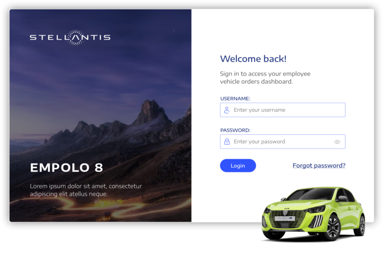
Working with a global automotive multi-brand organisation to redesign their Employee Vehicle Ordering Platform, improving the UI and UX to create a seamless and more intuitive experience.
Introduction
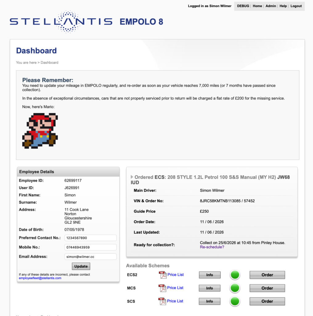
The Stellantis Empolo 8 employee vehicle ordering system had become dated and cumbersome, with a user experience and visual design that no longer reflected the Stellantis brand.
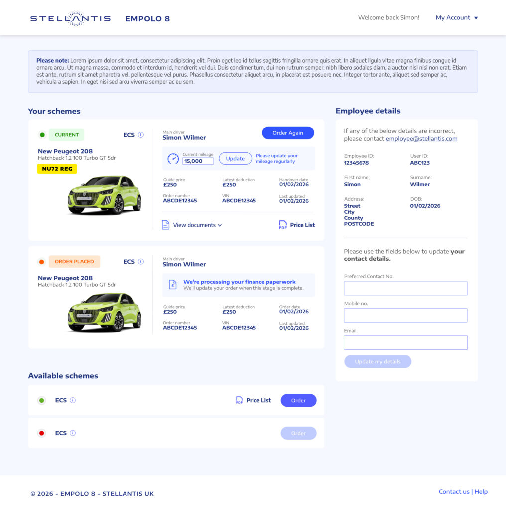
The objective was to review and improve the end-to-end vehicle ordering journey, identifying opportunities to simplify the experience, remove unnecessary friction and create a more modern, intuitive interface aligned with the wider Stellantis brand.
Although Empolo 8 is an internal employee platform, it still operates as a commercial service. Employees ordering vehicles through the various company car schemes represent revenue for Stellantis, while the management of orders, queries and support also requires significant internal resource.
With this in mind, I approached the project in the same way as any customer-facing digital product: understanding user needs, identifying pain points, simplifying journeys and measuring success through meaningful business outcomes.
The brief
The redesign wasn’t simply about making an internal system look better. It was about recognising that every interaction has a cost and an opportunity.
A confusing journey can result in an abandoned order, a support request or additional administrative work. Conversely, a clear and efficient experience can help employees complete their orders more confidently, increase conversion and allow Stellantis teams to spend more time on higher-value activities.
The goal was therefore to create a better experience for employees while delivering measurable operational and commercial value for Stellantis.
The opportunity
- Streamlining the vehicle ordering journey and reducing unnecessary steps
- Improving navigation and information architecture to make vehicles and schemes easier to discover
- Creating a clearer, more intuitive interface that aligned with Stellantis brand guidelines
- Reducing friction and uncertainty throughout the ordering process
- Improving self-service, helping employees find answers without needing administrative support
- Supporting higher conversion and completion rates across vehicle orders
- Reducing avoidable support queries, freeing administrative teams to focus on processing orders and managing vehicle programmes
- Creating a scalable design foundation that could support future improvements and additional functionality
The problems
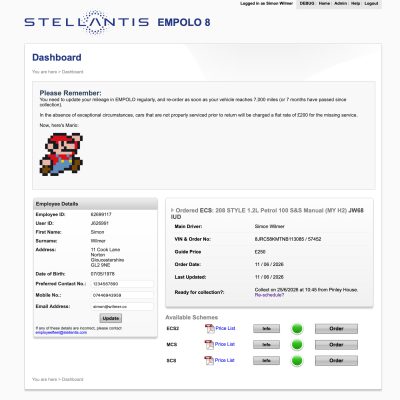
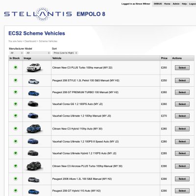
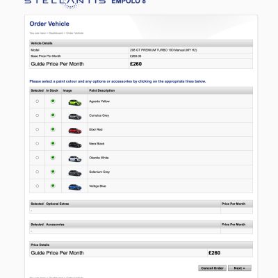
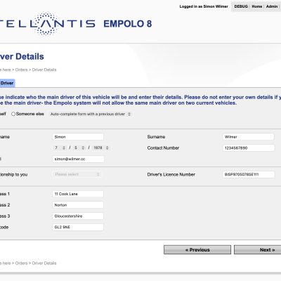
- Dated and disconnected visual experience
- Disjointed onboarding experience
- Lack of visual inspiration
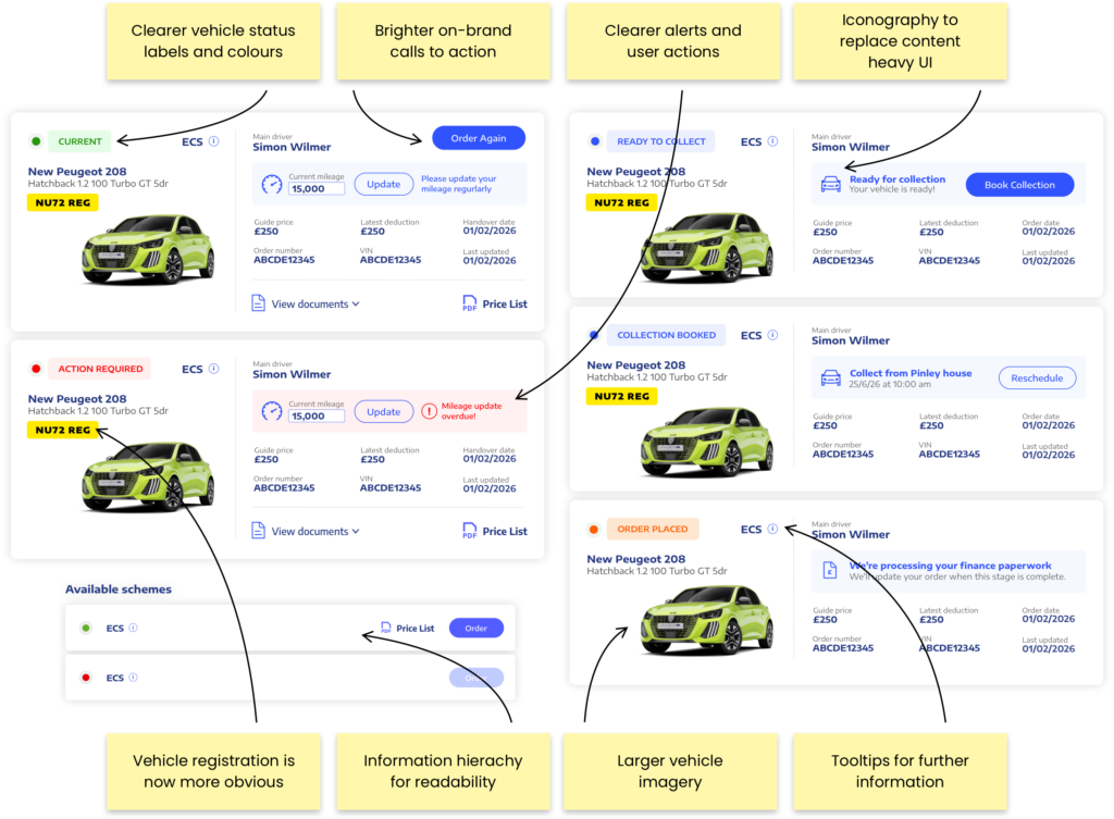
- Complex and inconsistent order statuses
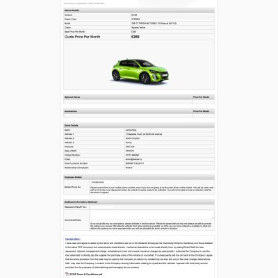
- Redundant and unnecessary content
- Collection journey created avoidable issues
- No underlying design system
- Information-heavy, repetitive pages
The core issue wasn’t simply that the platform looked dated. The underlying experience had accumulated complexity over time, creating friction for employees and additional operational overhead for Stellantis.
The solution
- Streamlining the vehicle ordering journey and reducing unnecessary steps
- Improving navigation and information architecture to make vehicles and schemes easier to discover
- Creating a clearer, more intuitive interface that aligned with Stellantis brand guidelines
- Reducing friction and uncertainty throughout the ordering process
- Improving self-service, helping employees find answers without needing administrative support
- Supporting higher conversion and completion rates across vehicle orders
- Reducing avoidable support queries, freeing administrative teams to focus on processing orders and managing vehicle programmes
- Creating a scalable design foundation that could support future improvements and additional functionality
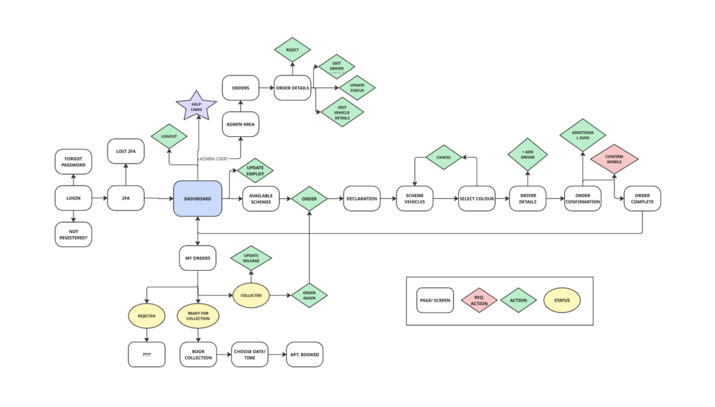
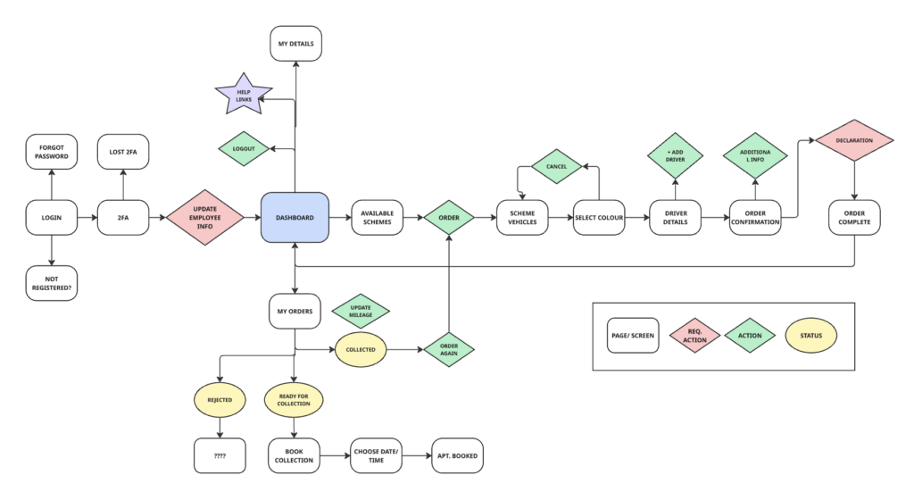
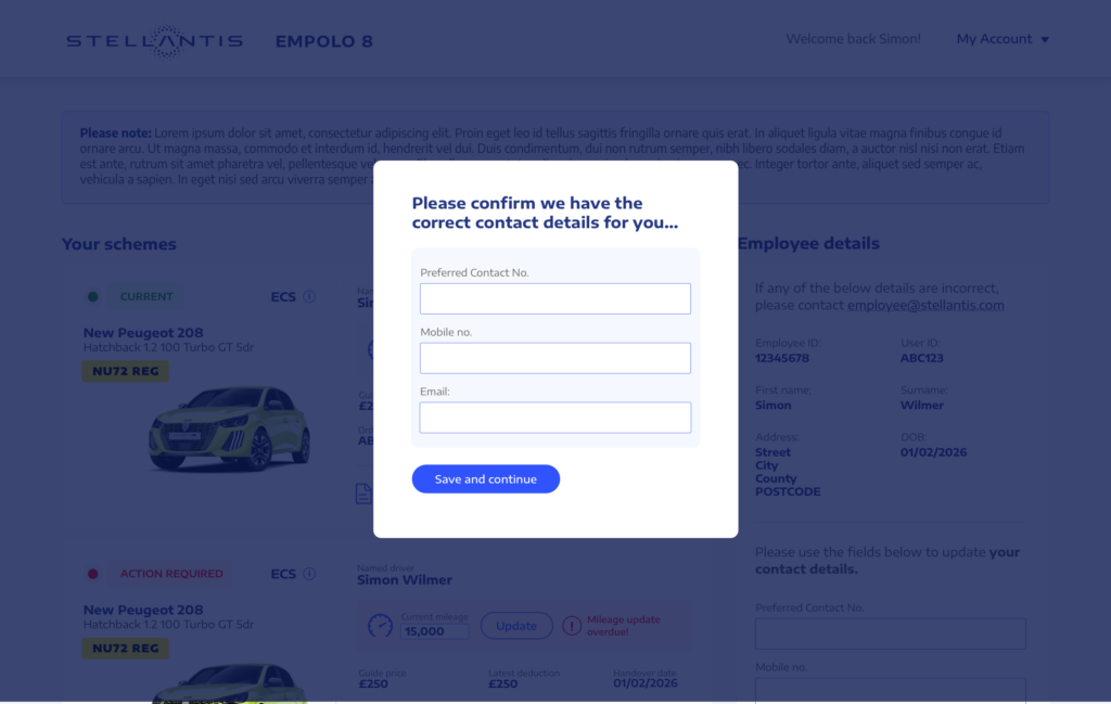
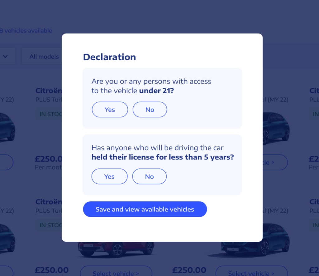
Mandatory declarations and data capture as part of the process
I suggested moving the declaration and employee detail checks to earlier in the process. That way employee information can be checked at the very start of the process and available vehicles can be filtered and shown based on the users information.
The conclusion
The Empolo redesign was an opportunity to move the platform beyond simply being an internal ordering tool and treat it as a digital product with both user and commercial value.
The redesigned experience creates a more intuitive, engaging and brand-aligned journey, while simplifying the underlying experience for employees and reducing opportunities for unnecessary support and administration.
Importantly, the work also establishes a stronger foundation for the future. Introducing a more consistent design language, reusable components and clearer user journeys makes the platform easier to maintain and provides a scalable foundation for future features, schemes and improvements.
The next stage will be about measuring the impact of the changes rather than assuming success. Once the latest usage, conversion and support data becomes available, we can establish a clearer baseline and identify where the biggest opportunities remain. This could include order completion and conversion rates, drop-off points, collection booking errors, support requests and engagement with key areas of the platform.
These insights can then feed into future iterations, allowing Empolo to evolve based on real user behaviour and business performance, rather than becoming another platform that gradually becomes outdated over time. This creates an ongoing cycle of measure → learn → improve → measure, ensuring the experience continues to deliver value for both employees and Stellantis.
Let's work together
Im looking for my next adventure, so if you think I could be a good fit within your team or a role you are looking to fill, please get in touch!