Reimagining the new-build home-buying experience. Designing a digital product that makes buying a new home simpler, more transparent and less stressful — from reservation through to moving day.
Buying a new home shouldn’t feel this complicated.
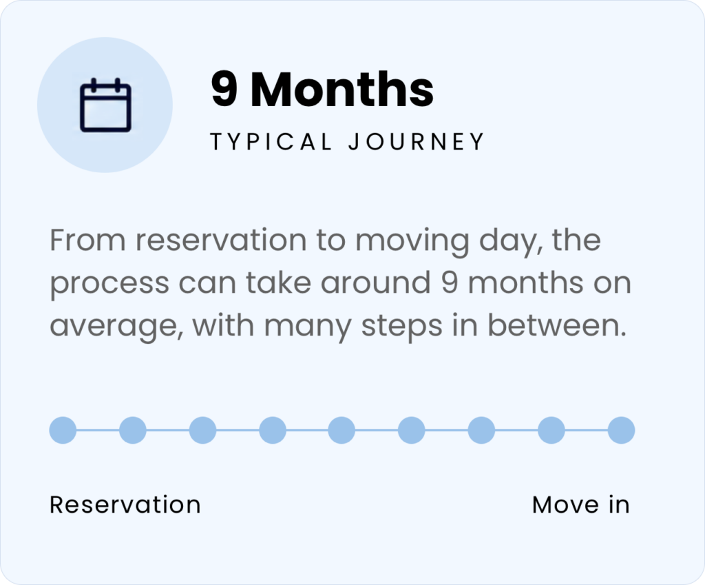
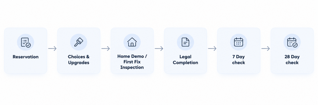
Buying a new-build home is an exciting experience, but the journey from reservation to moving day can be surprisingly complex.
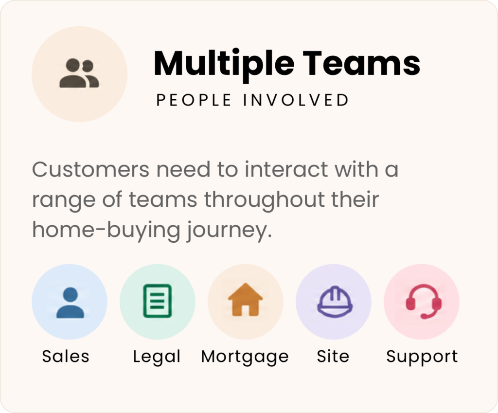
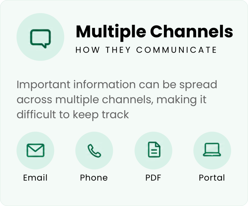
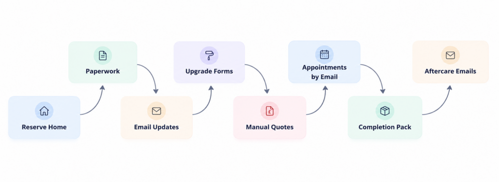
Customers are required to interact with multiple people, processes and systems throughout their purchase — from sales advisors and mortgage providers to solicitors, site teams and customer care. Important information can be spread across emails, phone calls, PDFs and different online systems, making it difficult for customers to understand where they are in the process, what they need to do and what happens next.
For the housebuilder, this fragmented experience creates challenges too. Teams spend significant time answering questions, chasing information, managing paperwork and providing updates that could potentially be handled through a better digital experience.
The problem
The experience is often transaction-led rather than customer-led.
Customers may have access to information, but not necessarily at the right time or in a way that helps them understand their journey.
This can lead to:
Uncertainty around the progress of their purchase
Repeated questions and requests for updates
Important tasks being missed or delayed
Information being difficult to find
A reliance on email and manual communication
Limited visibility of the construction process
A disconnected experience between sales, build and customer care
The opportunity
What if the entire new-home journey could be brought together in one simple, personalised digital experience?
A product that gives customers a clear view of where they are, what’s happening, what they need to do and what’s coming next — while giving housebuilders a more efficient way to communicate, manage and support their customers.
The opportunity wasn’t simply to digitise existing processes. It was to rethink the new-home buying experience from the customer’s perspective and create a product that could make the journey feel simpler, more transparent and more personal.
Understanding the new-home buying journey
Before defining the product, I wanted to understand the new-home buying experience from the customer’s perspective — not simply identify which existing processes could be moved into an app.
I combined user research, market and competitor analysis with a mapping of the end-to-end customer journey, looking for recurring moments of uncertainty, friction and unnecessary effort.
I also considered the operational perspective. A better customer experience shouldn’t just make buying a home feel easier; it should help housebuilders reduce repetitive administration, improve communication and create a more connected relationship with their customers.
The research highlighted a common theme: customers don’t necessarily need more information — they need clarity, context and confidence about what is happening and what they need to do next.
This became the foundation for the product strategy and helped define where a digital experience could provide the greatest value.
What I wanted to understand
01. How do people currently buy a new-build home?
Map the journey from initial discovery through to completion and moving in.
02. Where are the biggest pain points? Identify moments of uncertainty, repetition, delays and unnecessary effort.
03. What information do customers need, and when? Understand how information changes throughout the journey.
04. What are customers currently using to manage their purchase? Explore the role of email, phone calls, PDFs, portals, spreadsheets and other tools.
05. Where could digital genuinely improve the experience? Identify opportunities rather than assuming that every part of the journey needs to become an app feature.
Research findings
01
Customers don’t know where they are The process involves multiple stages and stakeholders, but customers often lack a single view of their overall progress.
02
“What’s next?” is a recurring question Customers aren’t necessarily looking for more information — they need the right information at the right time.
03
Email has become the default system Important updates, requests and documents are often buried across email conversations, making information difficult to retrieve.
04
The build journey is a missed opportunity Customers have a strong emotional connection to their new home, yet there can be limited visibility of what is happening while it is being built.
05
Customers want control From choosing upgrades to completing tasks, customers want to understand their options and feel more involved in the process.
06
The business benefits too Every unclear process can create additional calls, emails and manual administration for the housebuilder.
Insights into opportunties
Research insight
Design opportunity
Customers don’t know where they are
Create a personalised purchase timeline
Customers don’t know what’s next
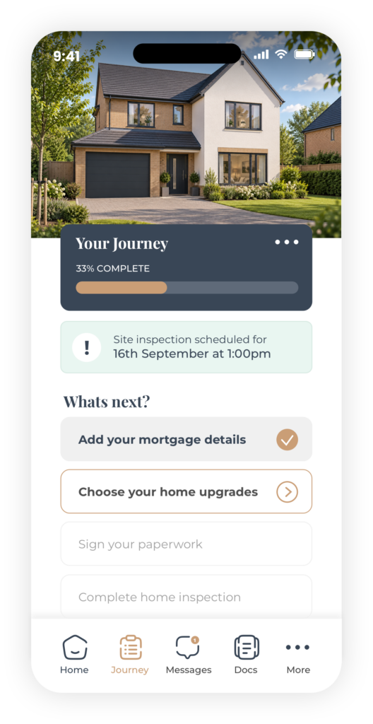
Introduce contextual tasks and next steps
Information is fragmented
Create a single document centre
Customers want build visibility
Introduce construction progress updates
Customers struggle with decisions
Create guided upgrade selection
Businesses spend time answering questions
Introduce self-service information and notifications
Product Strategy
The research highlighted that the new-home journey is long and complex, so trying to solve everything at once would risk creating an equally complicated digital product.
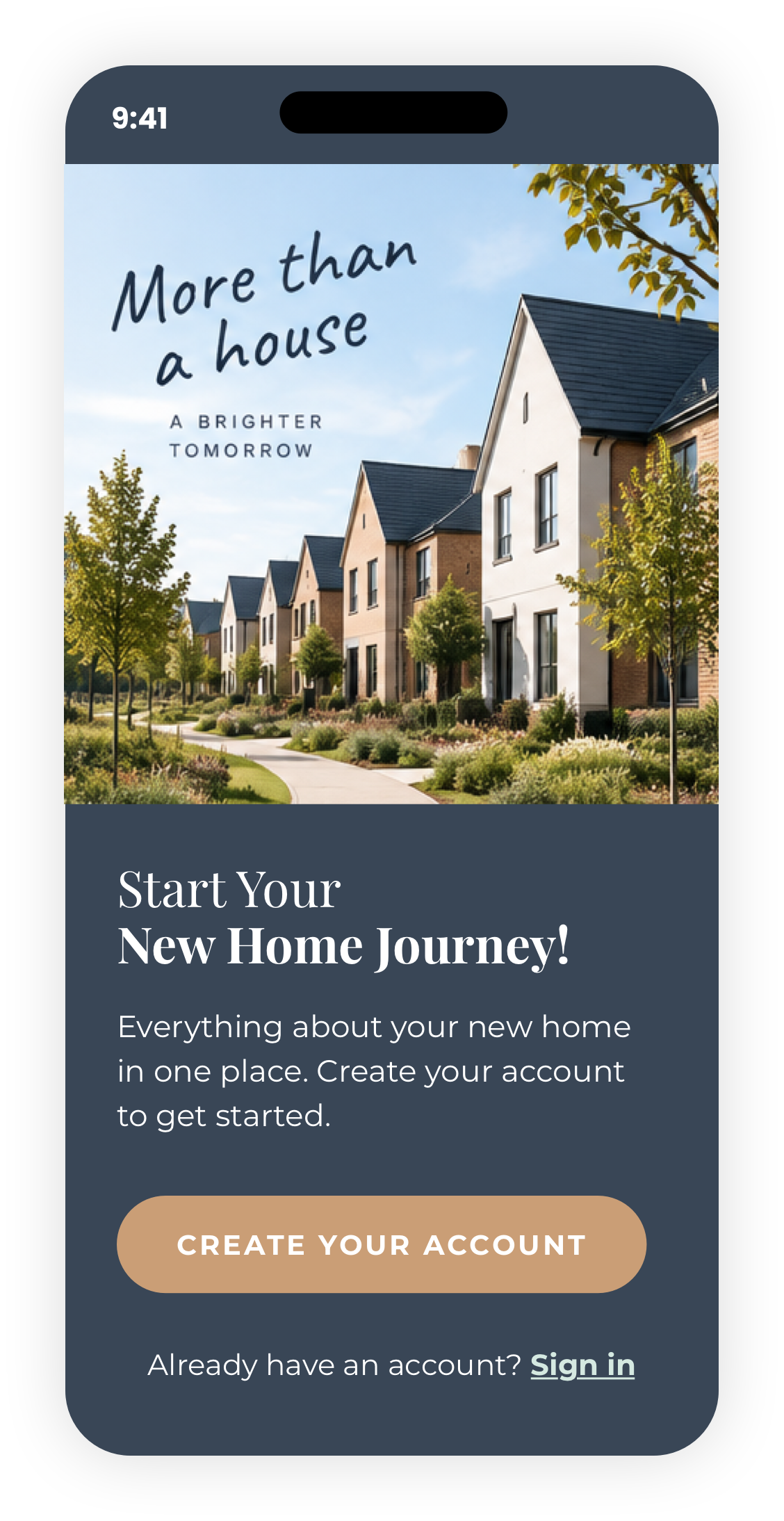
Rather than attempting to digitise the entire journey from day one, I decided to take a progressive approach — starting with the first meaningful interaction between the customer and the product: registration and onboarding.
The aim was to create a simple foundation that could grow into a much broader customer experience over time.
If we can make registration simple, useful and personalised from the outset, we can establish the foundation for a digital relationship that continues throughout the customer’s home-buying journey.
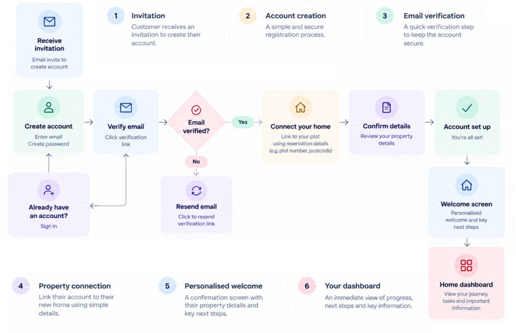
From invitation to personalised home dashboard
PROPOSED USER FLOW
Establishing a visual direction
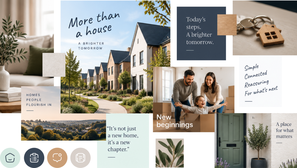
As this was a self-initiated project, there was no existing brand or visual language to work within. This gave me the opportunity to explore and define a visual direction from the ground up.
I began by collecting visual references, researching relevant brands and exploring imagery, typography, colour and UI patterns that could shape the look and feel of the product.
I wanted the experience to feel fresh, personable and friendly, while also communicating a sense of quality and trust. With the product centred around people’s homes and the idea of a new beginning, I explored a more natural and considered visual language — using soft, optimistic colours, warm imagery and subtle references to nature and sustainability.
The aim was to create a visual identity that felt clean and vibrant without becoming overly corporate, helping to make what can be a complex and stressful process feel more approachable and reassuring.
From invitation to value
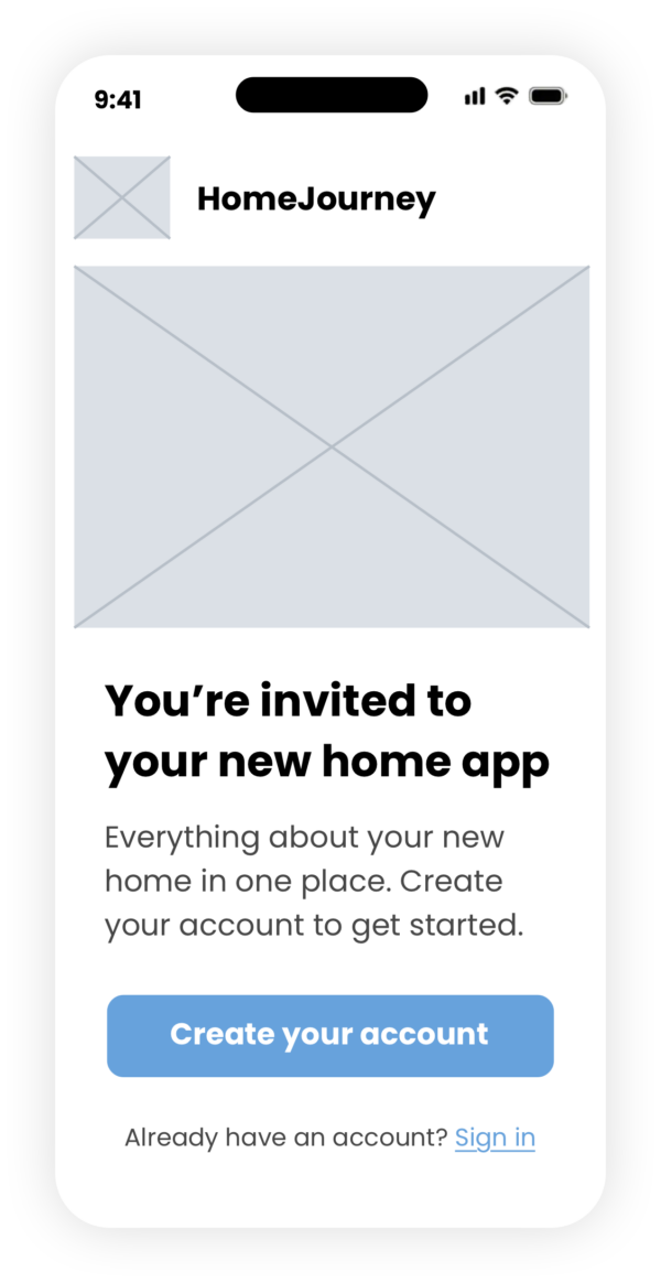
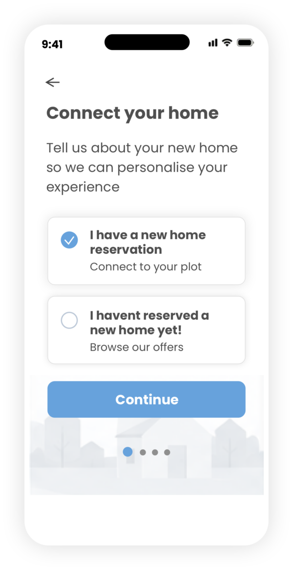
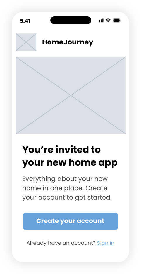
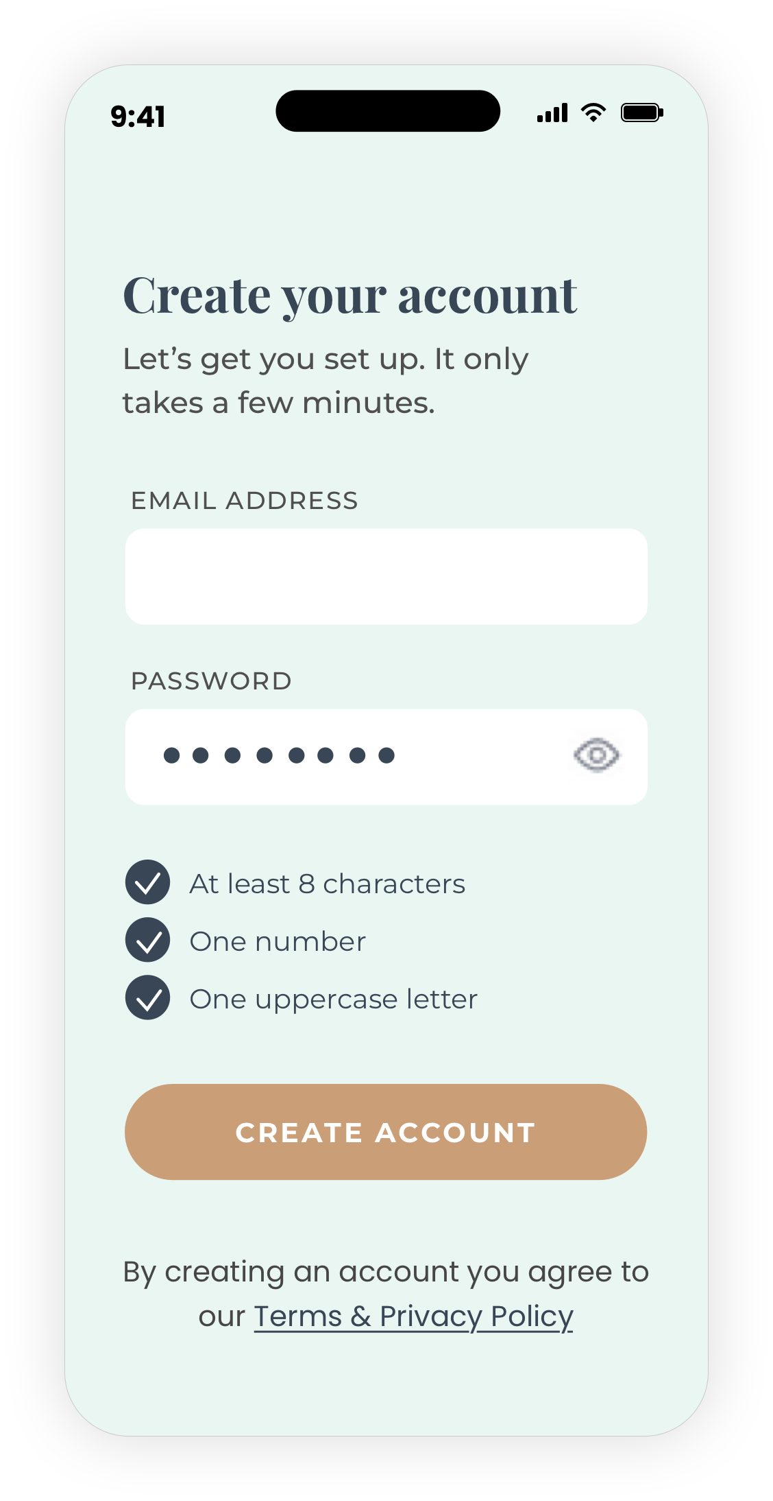
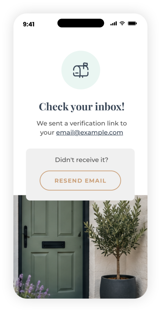
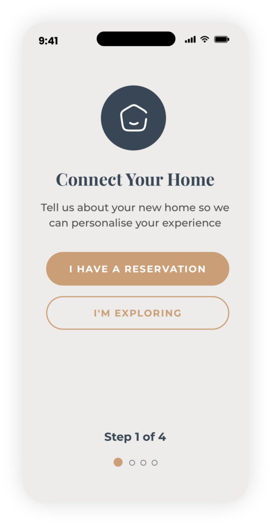
The first opportunity I explored was the registration and onboarding experience — the moment where a customer first moves from being a home buyer to having an ongoing digital relationship with their housebuilder.
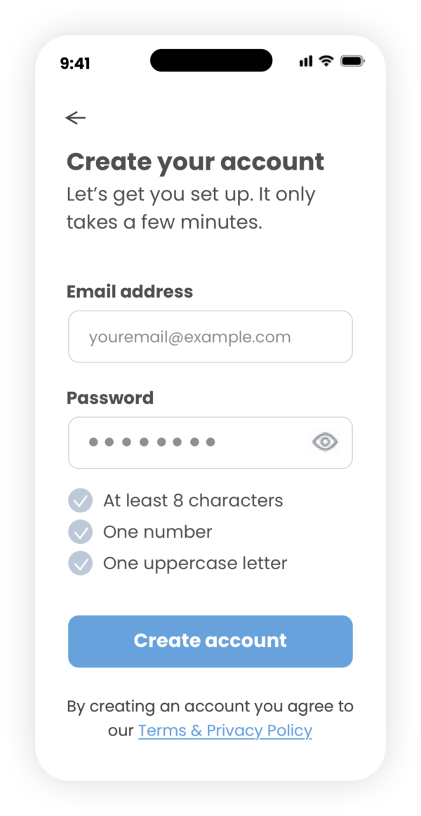
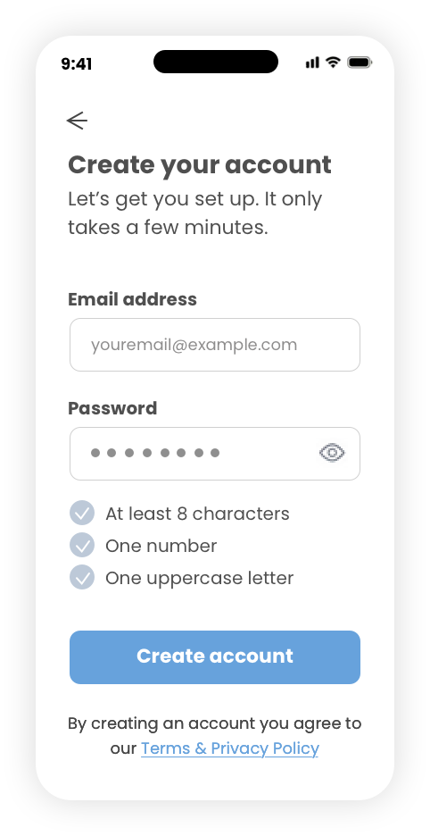
Rather than treating registration as a simple account creation exercise, I wanted to use it as an opportunity to establish trust, reduce friction and introduce the value of the product from the very beginning.
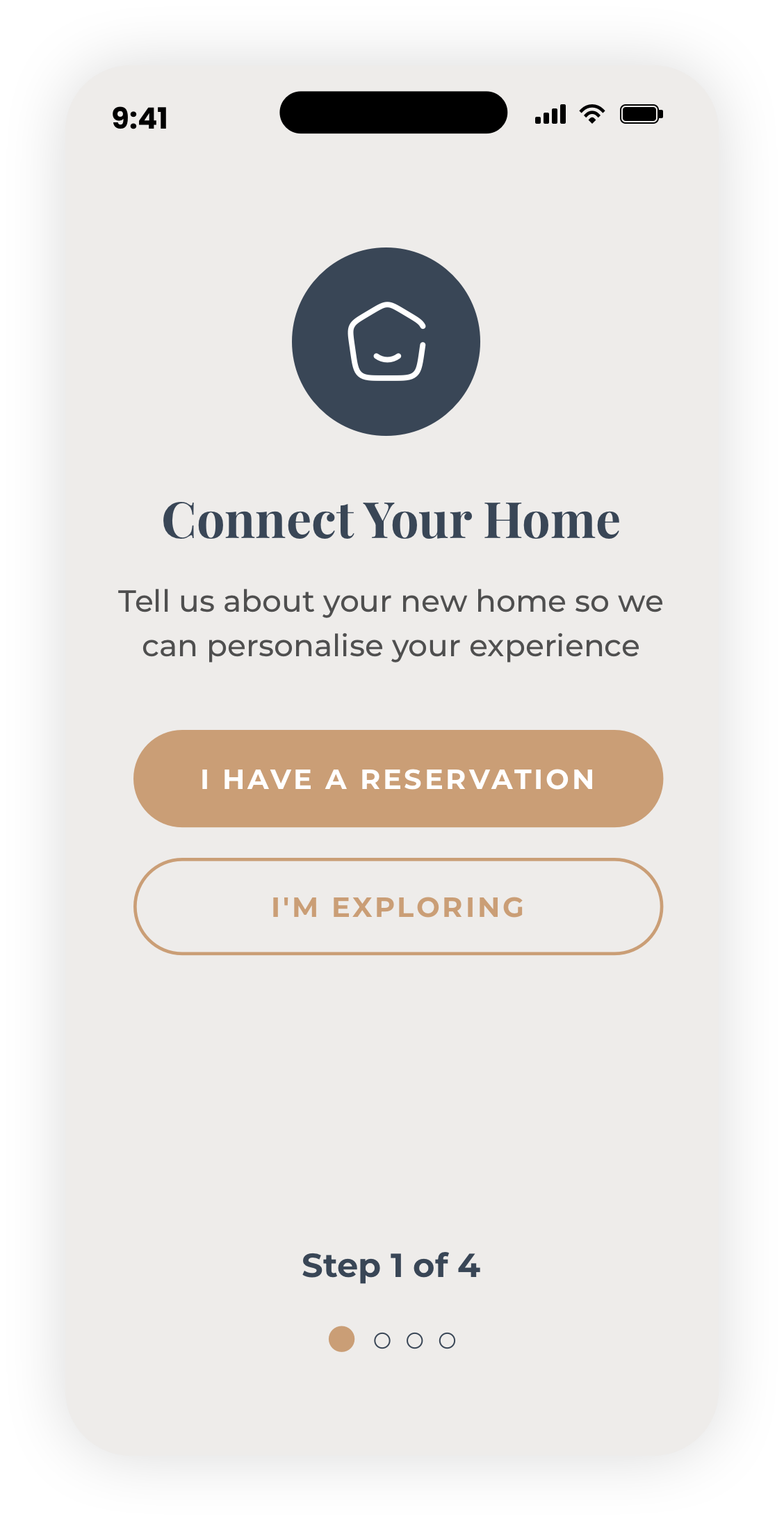
The experience needed to be quick and straightforward, while collecting enough information to connect the customer with their new home and create a genuinely personalised experience.
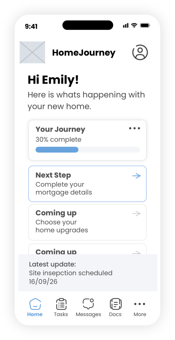
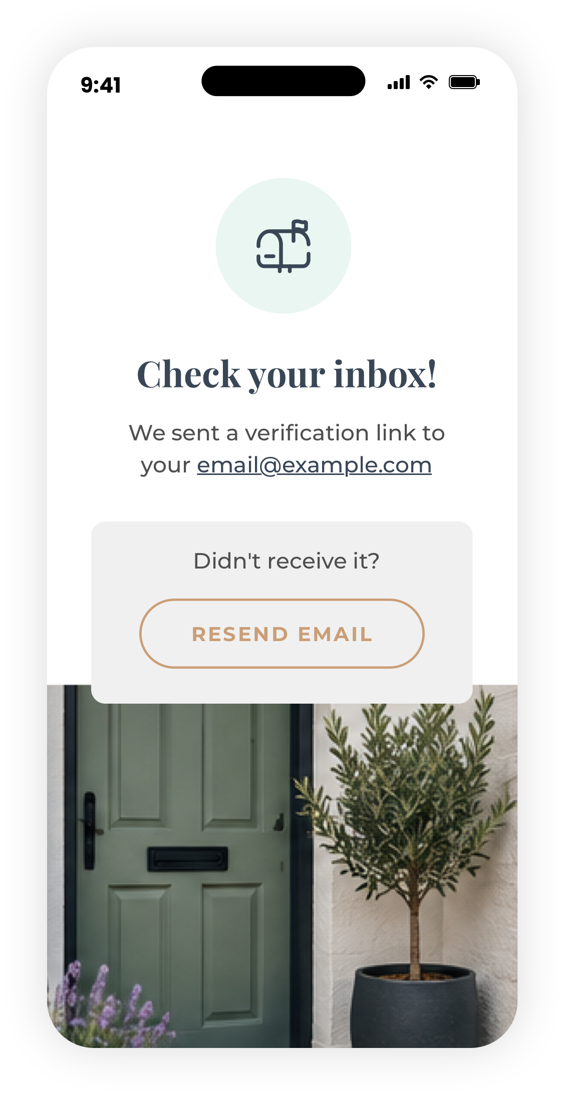
I mapped the journey from receiving an invitation through to arriving at a personalised home dashboard, considering the different scenarios a customer might encounter along the way and looking for opportunities to remove unnecessary steps.
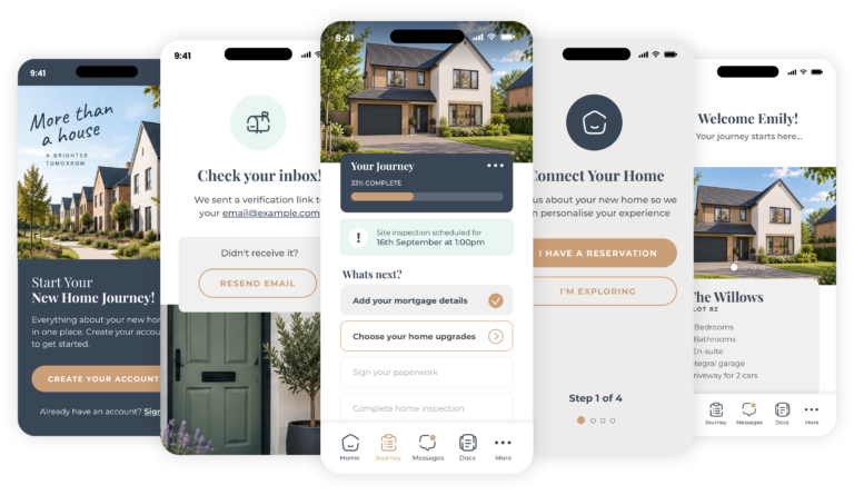
The goal: get customers registered, connected to their new home and seeing value as quickly as possible.
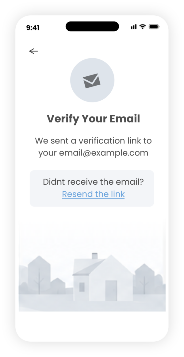
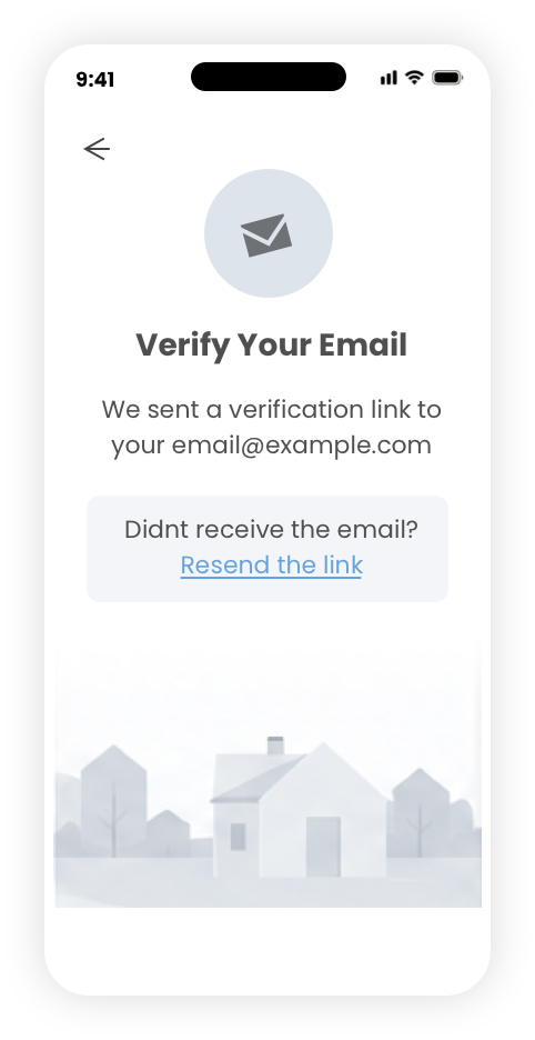
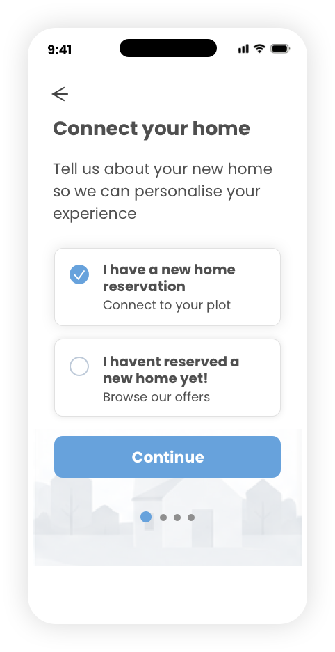
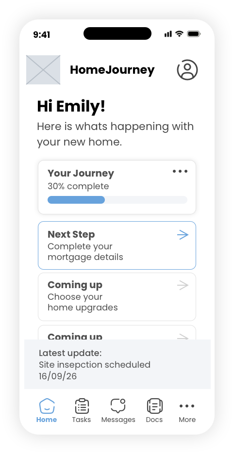
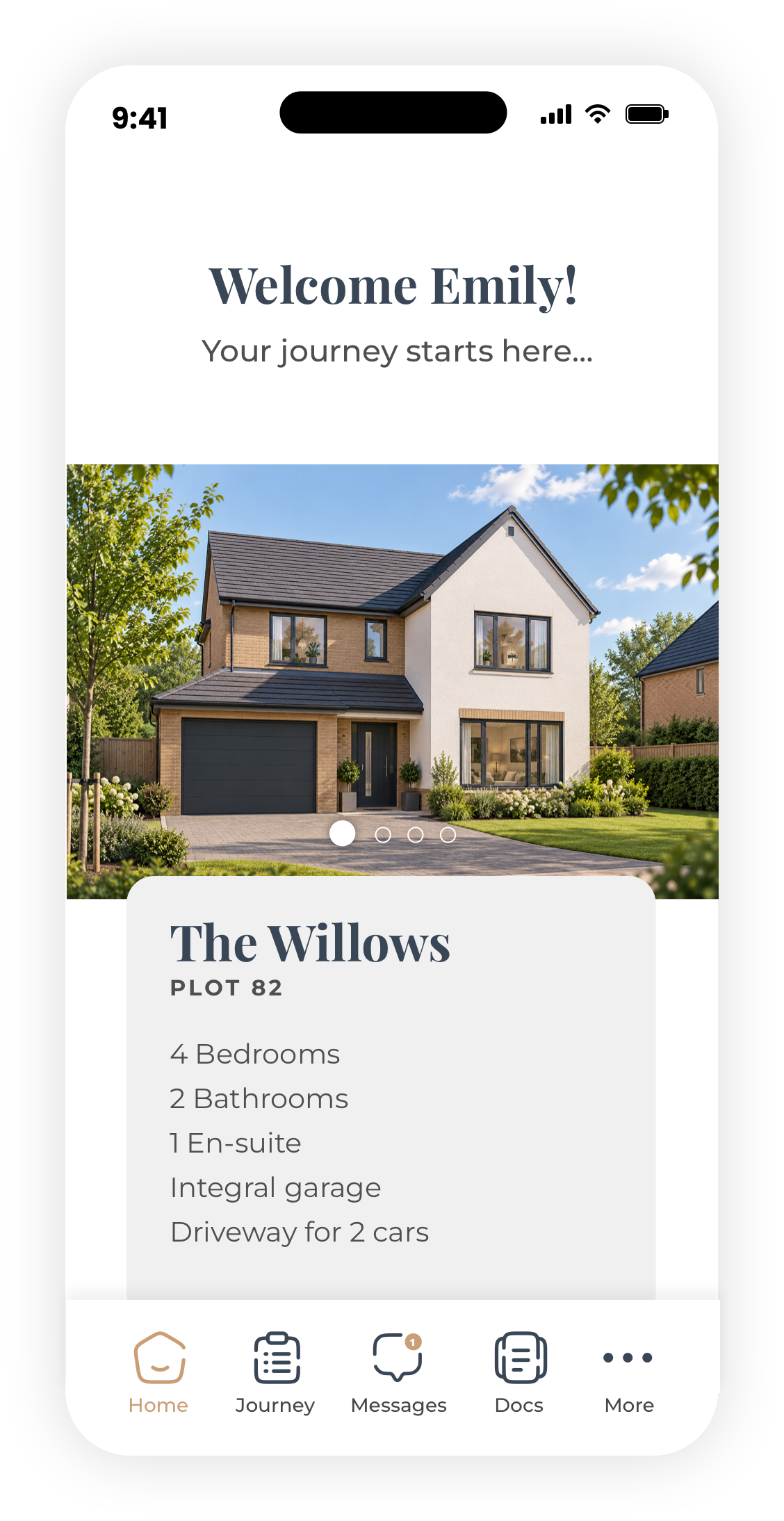
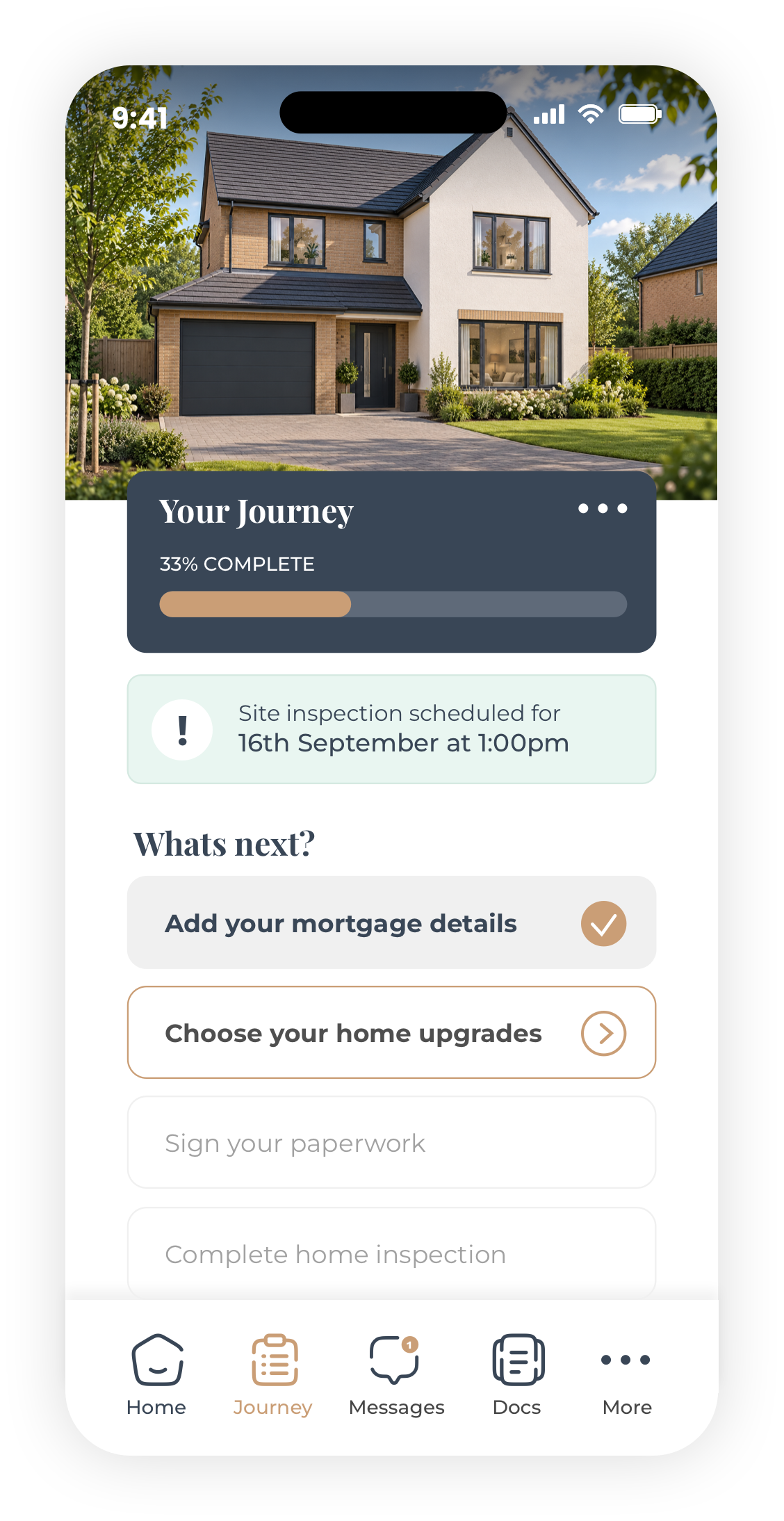
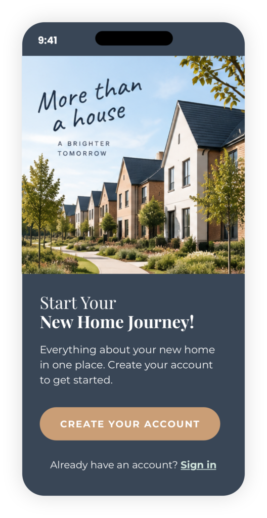
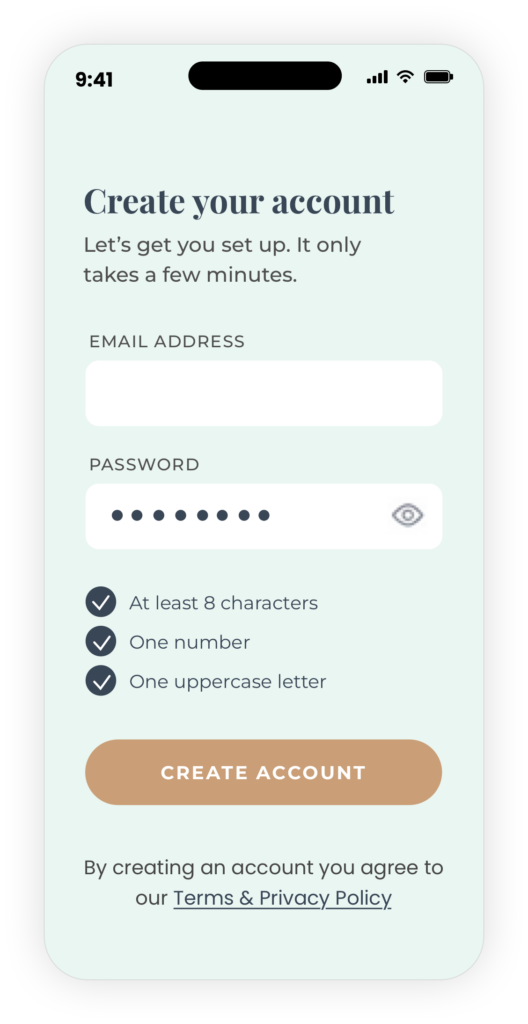
Then I’d put your six screens immediately underneath this, followed by a short section explaining the key UX decisions.
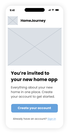
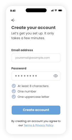
Initial visuals
Conclusion
The registration experience can become the foundation for the wider product, establishing a simple and personalised starting point for the customer journey.
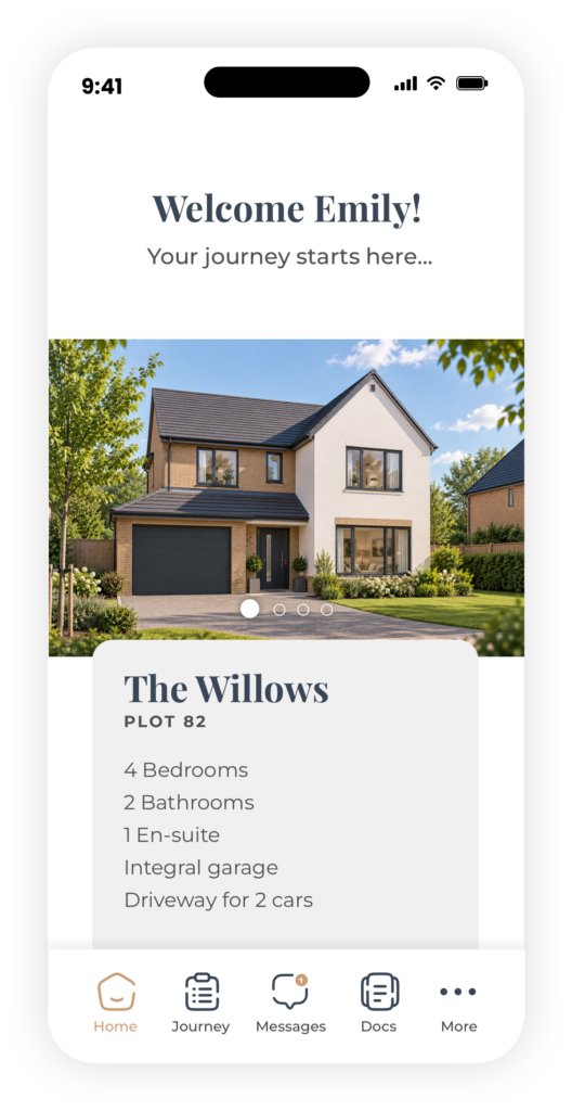
By connecting the customer to their specific home during onboarding, the experience can move beyond simply creating an account and immediately begin providing relevant information, tasks and updates.
This approach also creates a scalable foundation for the product to grow. Future iterations could introduce more of the customer journey — from documents and upgrades through to construction progress, appointments and aftercare — while continuing to use real customer behaviour, feedback and product data to identify where further improvements would have the greatest impact.
Let's work together
Im looking for my next adventure, so if you think I could be a good fit within your team or a role you are looking to fill, please get in touch!